After 18 months of work, Magic Lasso Adblock v4.5 has been released, delivering a complete redesign of the user-friendly, privacy aware and platform-native Safari ad blocker for the iPhone, iPad and Mac.
The goal of the re-design was to deliver a “powerfully simple ad blocking experience”. What does this mean in practice?
Firstly, all of the app’s functions have been simplified and placed into more intuitive groupings. Secondly, the redesign better surfaces and explains all of the app’s features. Finally, we’ve also focused on making advanced features, like Custom Rule creation, more accessible. Read on to see how this was achieved.
Exploring the challenges
In the 4 years since our last major visual change to Magic Lasso, the app has grown and evolved considerably. Many new features have been added such as YouTube ad blocking, Custom Rule creation and Adblock Performance Insights.
While valuable, each of these additions were layered onto the existing user interface. Whenever a new feature was added, design challenges kept arising. Where should the new feature be placed in the existing top-level groupings? How could it fit elegantly on the currently designed screens?
Parallel implementations were also required across two different UI frameworks. Once for the iPhone and iPad that utilised UIKit and once again for the Mac app that utilised AppKit.
The end result was an app that was slowly becoming more complex, requiring increased engineering time and slowing delivery of improvements to end-users. With this technical and design debt, the rationale for a redesign was clear.
Powerfully simple
From the start of the re-design process, we knew that we wanted to retain and lean-in to the app’s existing design values. Despite the redesign, Magic Lasso should continue to feel like an “ad blocker made for you”. An ad blocker that is easy to setup, easy to keep up to date and with Pro features available if you need them.
It should be simple for new users to quickly dive in. The new UI should also help to surface more advanced functionality, irregardless of a user’s technical know-how.
With the redesign, everyone should be able to see how easy it is to block annoying elements on a page with Tap to Block. Or, view the amount of energy and carbon reduction that using an ad blocker delivers.
All of this was summed up by the “powerfully simple” mantra that became our redesign’s goal and north star.
Key design highlights
The easiest way to see the new redesign is to experience it yourself. Nevertheless we’ve touched on some of the key improvements that have been made in the redesign below.
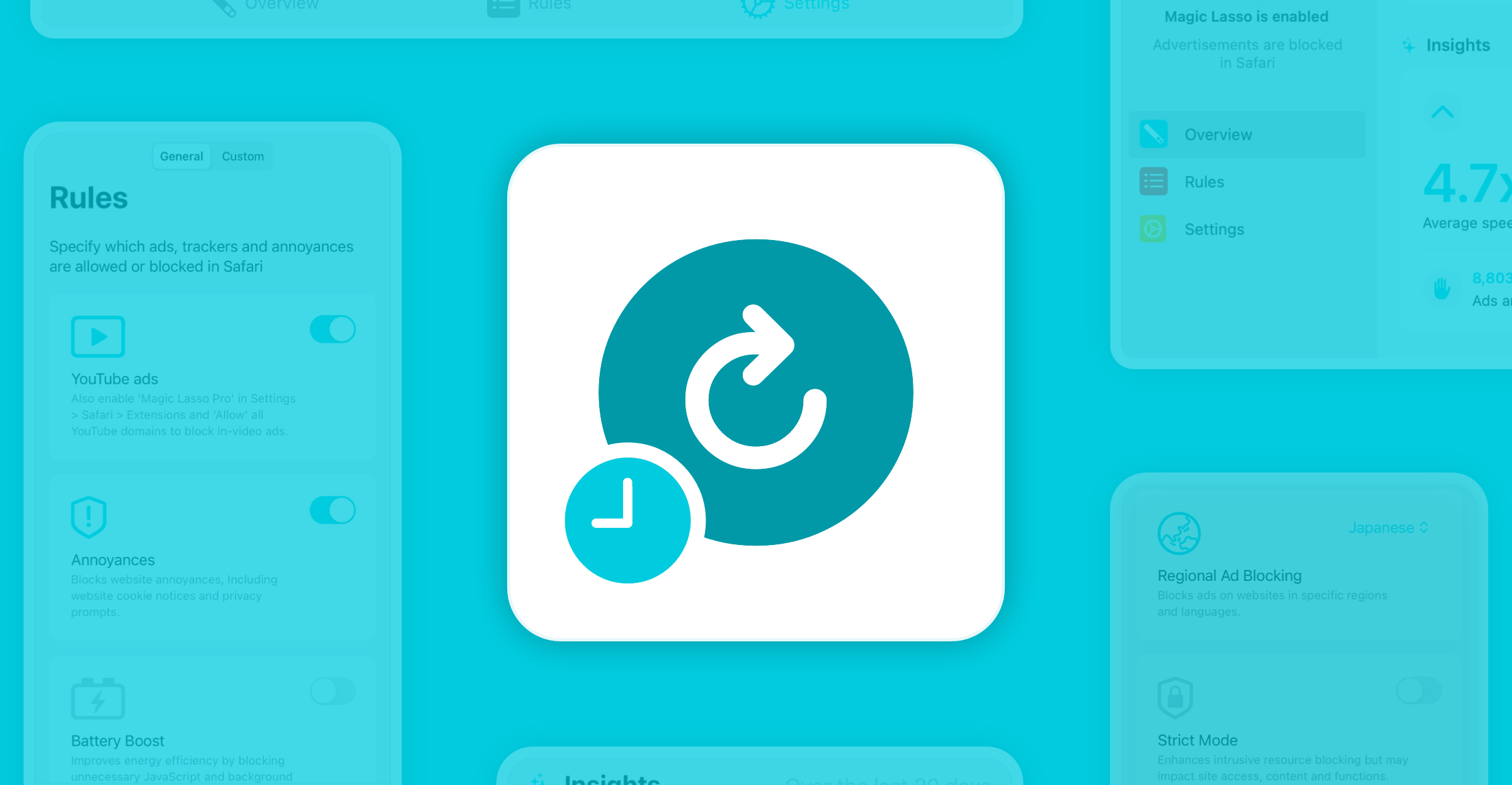
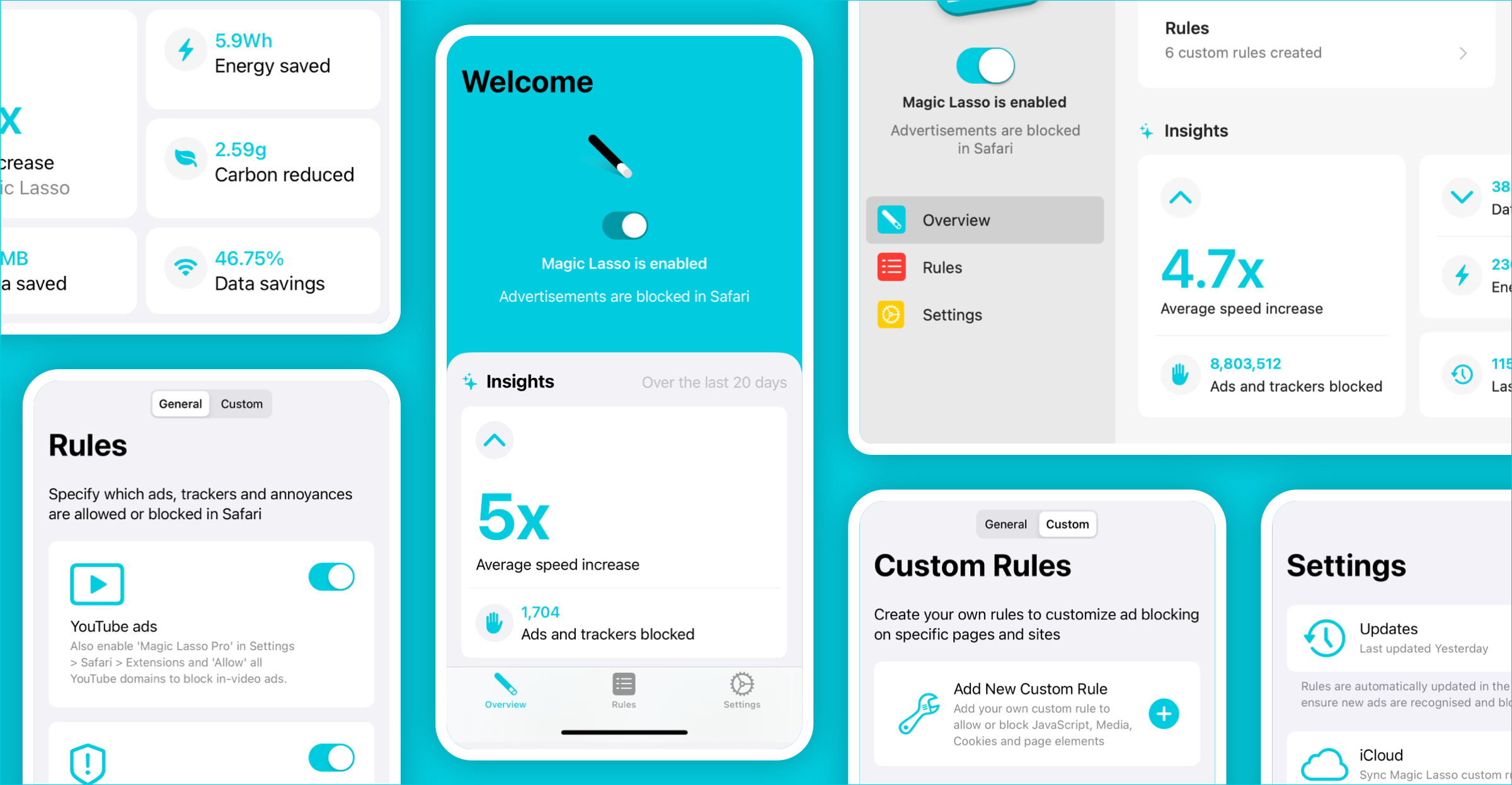
See the difference ad blocking makes
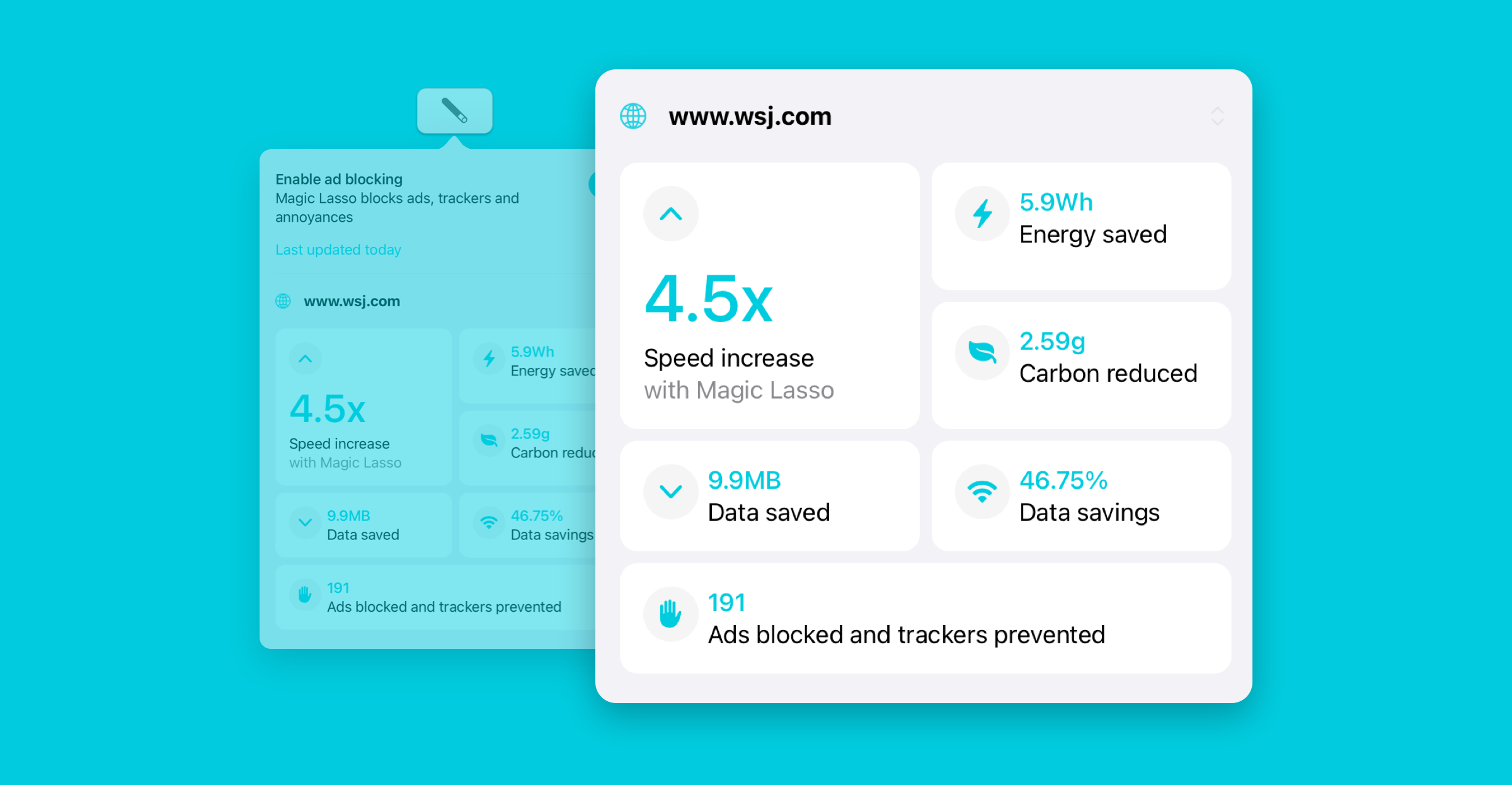
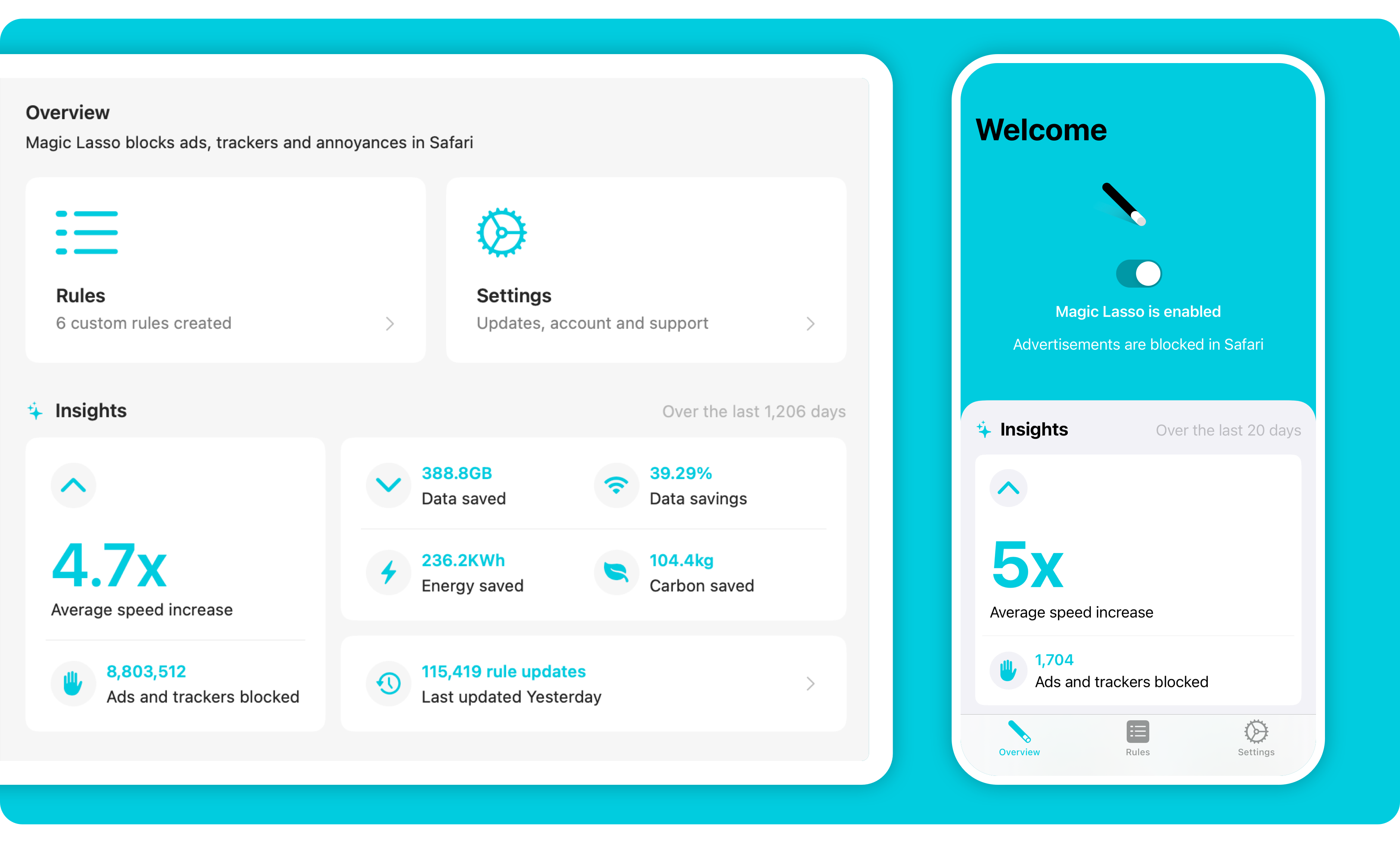 With Insights, in the updated Overview, you can easily see the data and energy saved, along with the average speed increase and total number of ads blocked since you enabled Magic Lasso. Insights on the Overview tab supplements Performance Insights which may be viewed for each individual site via the Magic Lasso Safari toolbar button.
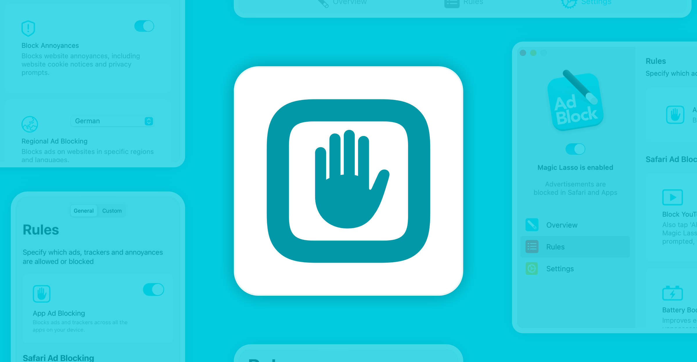
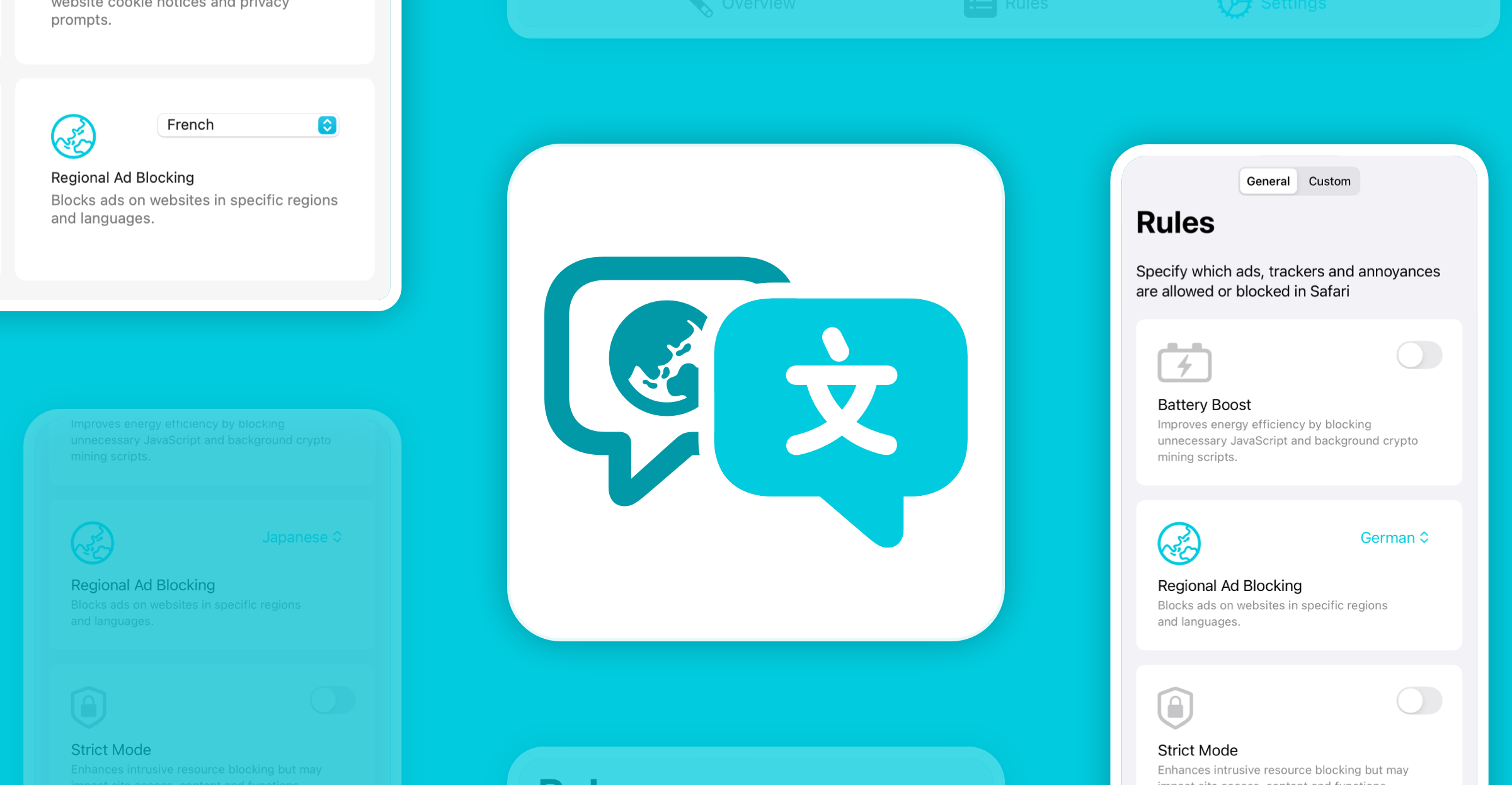
Simplified ad, tracker and annoyance blocking
 It’s now even easier to specify which ads, trackers and annoyances are blocked by Magic Lasso. The redesigned Rules tab shows each option clearly, with a simple toggle to enable or disable the feature.
Customise rules your way
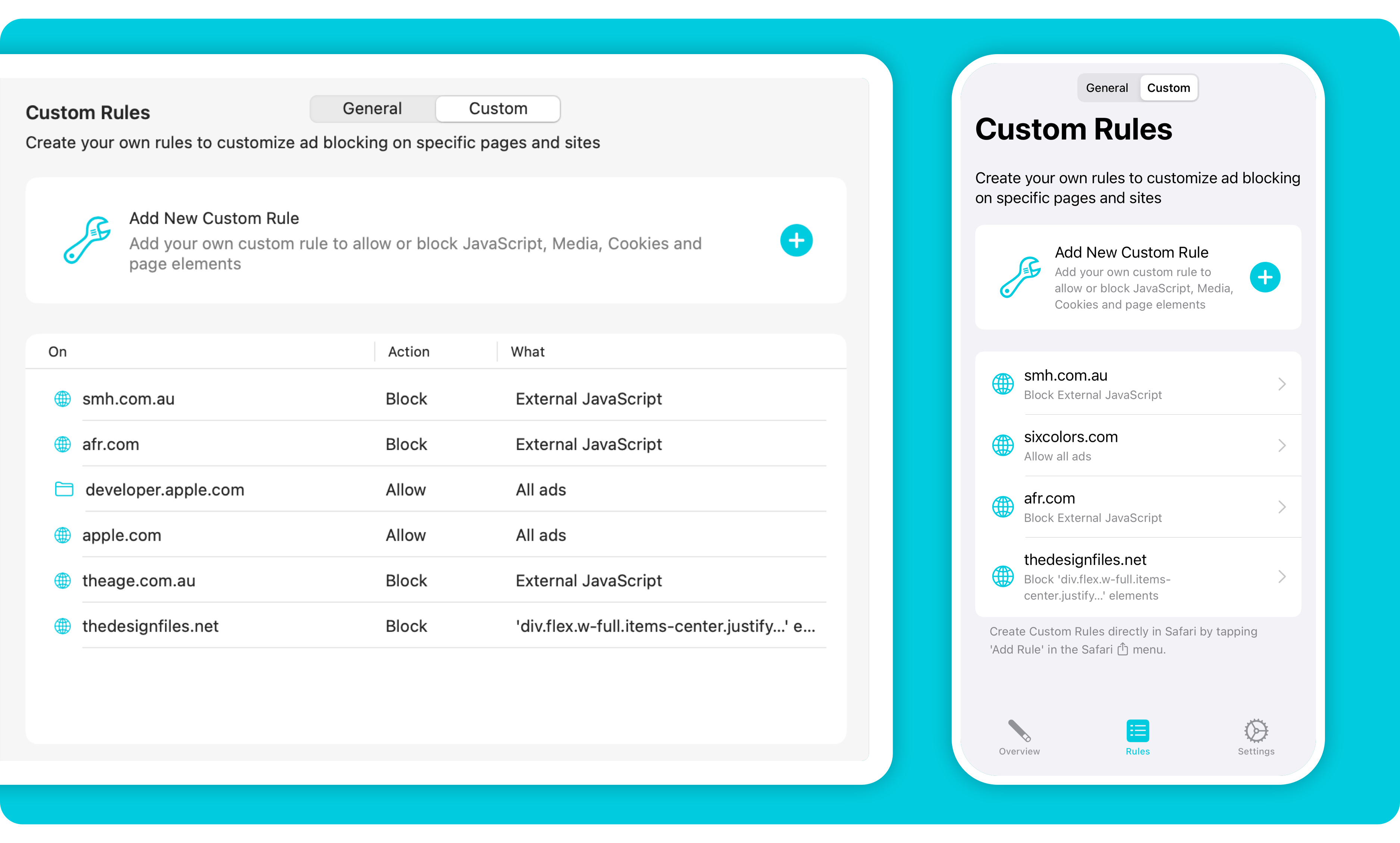 Create your own custom rules to allow or block JavaScript, Media, Cookies and page elements. And with Tap to Block, you can simply tap any element on a web page and watch it disappear from your view, ensuring it never disturbs your browsing again.
Faster future improvements
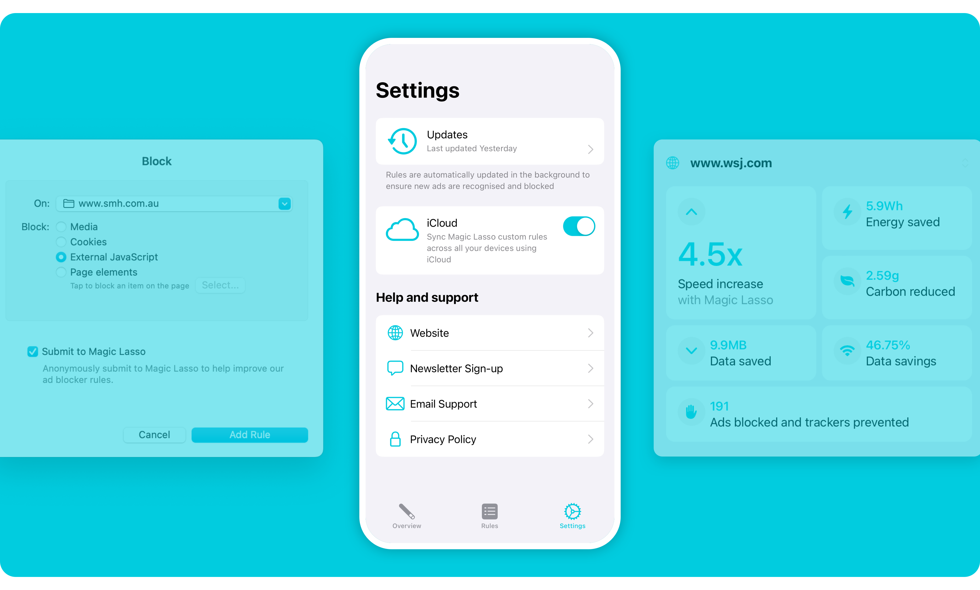 Under the covers, Magic Lasso has been re-architected using SwiftUI which enables a shared but tailored UI implementation across the iPhone, iPad and Mac apps.
The move to SwiftUI delivers improved user accessibility including complete support for variable type sizing and Dark mode. In the future, multilingual support will also be considerably easier to rollout.
Over 95% of the app’s UI is now written in SwiftUI, an increase from less than 30% this time last year. Using SwiftUI also means new UI features will now have to be implemented only once, removing the need for separately built iOS and macOS implementations.
Thoughts and feedback
From the very start of building Magic Lasso, we’ve been open to hearing from our users. Feedback, both negative and positive, is the wisdom that keeps an app like ours improving.
With the new design we hope existing users appreciate the improvements that have been delivered. For new users, we hope it helps them to more easily experience the benefits of ad blocking.
Either way, feel free to send us an email with your thoughts. Let us know what you like or perhaps don’t like about the redesign. Also, if you’re interested in posts like this, you might want to explore further with our Magic Lasso Adblock Year in Review series of posts from 2018 or 2023.
And, if you’ve never used an ad blocker on your iPhone, iPad or Mac you may want to give Magic Lasso Adblock a try. It’s the best way to see the redesign yourself and experience a cleaner, faster web – withouts ads.